Commit Graph

647 Commits

Author SHA1 Message Date
Carlos Soriano
0418b68051 popupMenu: Use an image for arrows
Until now the arrows were the associated arrow
character of the font. This cause some problems like
different arrows for different fonts, and size can be
altered because of the font size.
To solve that, use an image for the arrows.

https://bugzilla.gnome.org/show_bug.cgi?id=720206
2014-02-19 13:44:27 +01:00
Carlos Soriano
fff2ca6f26 telephatyIdle: Time stamps next conversation line
To give more context to the chat notification bubble, put the
time stamp next to the last conversation line instead of
a new line.

https://bugzilla.gnome.org/show_bug.cgi?id=708031
2014-02-17 20:00:00 +01:00
Reda Lazri
92ae26bb9f Fix username shadows in Lock/Loginscreen
https://bugzilla.gnome.org/show_bug.cgi?id=723833
2014-02-07 16:20:14 +00:00
Giovanni Campagna
ea1f5a8fc6 NMWirelessDialog: show an informative message when airplane mode is on
Rather than just showing "No networks", inform the user if airplane
mode is on or if wifi is off, and allow the user to change that
from the dialog (if possible).

https://bugzilla.gnome.org/show_bug.cgi?id=709128
2014-02-04 22:25:06 +01:00
Tarun Kumar Joshi
297877fbe2 theme: Set -arrow-rise property of backgroundMenu to 0
Background menu shown on right clicking desktop background has an arrow
pointer which points to nothing. This patch sets its height (rise) to 0
so that no arrow is formed.

https://bugzilla.gnome.org/show_bug.cgi?id=699608
2014-01-15 18:28:31 +01:00
Yosef Or Boczko
53b37e8d0c endSessionDialog: Align some strings to the right in RTL
https://bugzilla.gnome.org/show_bug.cgi?id=712600
2013-12-11 22:42:01 +02:00
Yosef Or Boczko
f8eb8adfbe keyring: Align some srtings to right in RTL
https://bugzilla.gnome.org/show_bug.cgi?id=712594
2013-12-11 22:40:18 +02:00
Yosef Or Boczko
ea86c9bafb userWidget: Fix the padding in RTL
https://bugzilla.gnome.org/show_bug.cgi?id=712638
2013-12-11 22:35:44 +02:00
Sebastien Lafargue
eea689841b highlight session menu button on key focus
https://bugzilla.gnome.org/show_bug.cgi?id=710539
2013-11-15 11:29:21 -05:00
Jasper St. Pierre
9862185bda theme: Clean up
Remove some unused CSS
2013-11-15 11:14:35 -05:00
Sebastien Lafargue
d47ecf19f5 need space between item in endsession dialog session-list and app-list
https://bugzilla.gnome.org/show_bug.cgi?id=710543
2013-10-26 16:24:41 +02:00
Florian Müllner
a16f699dfc theme: Add some vertical padding on login screen
This was apparently lost during some rewrite this cycle ...

https://bugzilla.gnome.org/show_bug.cgi?id=710555
2013-10-25 14:15:10 +01:00
Florian Müllner
af1f9cd76d network: Don't use StButtons for items in selector
Their use blocks activation of the default button by keyboard, which
is important for accessibility. Use a Clutter.ClickAction instead,
which doesn't have this problem as it only considers mouse events.

https://bugzilla.gnome.org/show_bug.cgi?id=710144
2013-10-17 19:46:30 +02:00
Jasper St. Pierre
ad043e009e workspaceThumbnail: Drop the _background hack
The _background hack was added because the old way the zooming animation
worked, it set the allocation of the workspaces view and thumbnails box
to the final position and used animations to smoothly animate.

During the 3.6 cycle when we added the new search view, Cosimo changed the
way the zoom animation works so that rather than set the final allocation
and animate, we actually do adjust the allocation of the workspaces view
and thumbnails box.

So, as the hack is no longer necessary, we can drop it.

https://bugzilla.gnome.org/show_bug.cgi?id=694881
2013-10-12 14:38:13 -04:00
Carlos Soriano
63593e45a6 Make dropdown arrows consistent size
Since the agregate menu does 120% of font-size, make this
for all dropdown arrows in gnome-shell and rename the css
class to make clear that it is used in overall gnome-shell

https://bugzilla.gnome.org/show_bug.cgi?id=709564
2013-10-11 17:32:55 +02:00
Yash Girdhar
51e016a0d6 theme: modify the avatar and user name
Change the avatar and user name border radius, padding
and text size to be consistent with mockups.

https://bugzilla.gnome.org/show_bug.cgi?id=702309
2013-10-02 22:26:30 +02:00
Carlos Soriano
02f5500641 theme: Make indicators checked&active like checked 2013-09-27 17:06:26 +02:00
Carlos Soriano
465af55d6e theme: Add hover/active states to indicators
Until now we had the same svg for hover, active and checked
states in the pagination indicators. Just differentiate between
them using differents svg.

svg files provided by Jakub Steiner

https://bugzilla.gnome.org/show_bug.cgi?id=708852
2013-09-27 15:50:28 +02:00
Adel Gadllah
a06a78a9c1 aggregate-menu: Increase width
Add 20px more width to make longer strings (translations) fit better.

https://bugzilla.gnome.org/show_bug.cgi?id=708472
2013-09-23 22:23:46 +02:00
Carlos Soriano
93d9c16672 appDisplay: Rework indicators animation
Previously the animation was not entirely according to the mockup.
Now we are closer to the mockup.

The padding for the indicators are decremented, since we need that
to make the animation not too quick. As a drawback, maybe visually
is not as good as before, or the area to click dots is too much little.
Just make that change for now and test it widely, and we can change
that after.

https://bugzilla.gnome.org/show_bug.cgi?id=707565
2013-09-16 18:49:24 +02:00
Carlos Soriano
72f0a48fac theme: Erase appDisplay padding
Since now AllView doesn't have a scrollbar this
padding is not necesary, and will allow to place
the indicators correctly using only the indicators
padding in a upcoming patch.

https://bugzilla.gnome.org/show_bug.cgi?id=707580
2013-09-13 18:13:41 +02:00
Carlos Soriano
8ce599df38 theme: Change overview icon shadow inset opacity
In the commit 9a8bf3b was changed the background opacity of overview
icons. That cause that the shadow of the checked state of icons
was too hard, so it seems to be cut off.
Change the opacity of the shadow to solve this.
2013-09-09 13:37:36 +02:00
Florian Müllner
beec47d7ad theme: Decrease padding on folder view popup
If a folder view is scrolled, its scrollbar ends up too close to the
content (even partially overlapping it) with the current padding.
Making it much smaller fixes the issue without affecting the content
position - the removed padding will just move to IconGrid's dynamic
padding.

https://bugzilla.gnome.org/show_bug.cgi?id=707662
2013-09-06 23:54:46 +02:00
Carlos Soriano
38d9c16aba gnome-shell.css: typo replace tabs with spaces 2013-09-04 09:48:07 +02:00
Jakub Steiner
cf9842433e search: "pushed in" :active state
https://bugzilla.gnome.org/show_bug.cgi?id=704714
2013-09-03 17:19:53 +02:00
Giovanni Campagna
9ea0f7255f PageIndicators: extend the clickable area
Replace the inactive spacing with clickable padding inside the
buttons, for easier selection with a mouse.

https://bugzilla.gnome.org/show_bug.cgi?id=707314
2013-09-02 22:53:04 +02:00
Carlos Soriano
a765dfc52e appDisplay: Show label when frequent app view is empty.
Currently we show a empty view, that seems broken, so we add a label
showing that there's not enough frequent applications to show.

https://bugzilla.gnome.org/show_bug.cgi?id=694710
2013-09-02 21:25:03 +02:00
Carlos Soriano
9a8bf3b881 theme: Change icons style to follow new design
Change the background, glow and labels of the Dash and AppDisplay
to follow the new design

https://bugzilla.gnome.org/show_bug.cgi?id=706081
2013-09-02 20:36:39 +02:00
Carlos Soriano
dcea8bed6d appDisplay: Add page indicators
Add indicators to the pagination in AllView, which displays
how many pages of apps we have and allows the user to
navigate through them.

https://bugzilla.gnome.org/show_bug.cgi?id=706081
2013-09-02 19:51:00 +02:00
Carlos Soriano
e8b35f4623 theme: Change app picker bottom padding
Increase the bottom padding between the views and the control buttons
of the AppDisplay to be more eye pleasant

https://bugzilla.gnome.org/show_bug.cgi?id=706081
2013-09-02 19:47:05 +02:00
Carlos Soriano
754ca7c8f2 appDisplay: Paginate AllView
Organize applications in AllView by pages using the new PaginatedIconGrid
added previously. Pagination is generally a better pattern for collections
than scrolling, as it better suits spacial memory.
Hook into AppDisplay's allocation function to communicate the available
size to the different views before child allocations - this is only
required by the paginated view (as pages must be computed before
calling get_preferred_height/get_preferred_width), but doing it for
all views will guarantee that their dynamic spacing calculation is
based on the same values.

https://bugzilla.gnome.org/show_bug.cgi?id=706081
2013-09-02 19:06:35 +02:00
Alejandro Piñeiro
a4c1eb12b4 a11y: calendar: full date string should be navigable
Also moved the set of label_actor of the menu some lines before,
to improve readability.

https://bugzilla.gnome.org/show_bug.cgi?id=706903
2013-08-28 19:13:33 +02:00
Alejandro Piñeiro
4e80758970 a11y: calendar: Month name should be navigable
https://bugzilla.gnome.org/show_bug.cgi?id=706903
2013-08-28 16:23:09 +02:00
Allan Day
f176d890c0 Increase padding between system status icons
Makes the icons easier to read, and increases the size of the
click target a bit.

https://bugzilla.gnome.org/show_bug.cgi?id=706796
2013-08-28 14:36:50 +01:00
Ray Strode
268ac0bde8 theme: add bottom badding for login dialog hint
Since we're getting rid of the top padding, we need to add what we
take away to the bottom padding to keep the size the same.

https://bugzilla.gnome.org/show_bug.cgi?id=706670
2013-08-27 10:31:26 -04:00
Ray Strode
88e3f6af47 authPrompt: give message label an initial style
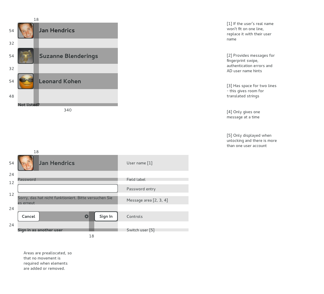
This commit consolidates the styles of the various
message types into one 'login-dialog-message' style
and then adds additional styles on top to cover the
differences.

This allows us to give the message label an initial
style so that is padded properly before any messages
are displayed.

https://bugzilla.gnome.org/show_bug.cgi?id=706670
2013-08-27 10:20:16 -04:00
Jasper St. Pierre
41aa14eaf0 gdm: Remove constraints from authPrompt / loginDialog as well
https://bugzilla.gnome.org/show_bug.cgi?id=706843
2013-08-26 19:05:15 -04:00
Jasper St. Pierre
1f50f4658d unlockDialog: Remove clutter constraints from the code
These cause annoying allocation cycle warnings, and it's simpler to
just express our desired layout in terms of nested containers.
Adapt the theme to match as well.

https://bugzilla.gnome.org/show_bug.cgi?id=706843
2013-08-26 19:05:15 -04:00
Jasper St. Pierre
dd8fd09470 endSessionDialog: Split into two sections
https://bugzilla.gnome.org/show_bug.cgi?id=706612
2013-08-26 10:02:44 -04:00
Jasper St. Pierre
1a415d5fa7 userWidget: Actually respect the iconSize parameter
The iconSize parameter was only being respected if it was the
default icon fallback.

https://bugzilla.gnome.org/show_bug.cgi?id=706681
2013-08-23 13:25:11 -04:00
Jasper St. Pierre
e4d46aee97 endSessionDialog: Remove the interactivity of the end session dialog
This was always sort of a hidden feature, and with the new designs
it's going to get unclear about what's clickable, and what's not.

https://bugzilla.gnome.org/show_bug.cgi?id=706612
2013-08-23 13:25:11 -04:00
Jakub Steiner
d4f66da793 theme: small round button for system menu actions
- got freeze break from release team (2) and the docs team

https://bugzilla.gnome.org/show_bug.cgi?id=706638
2013-08-23 15:49:01 +02:00
Jakub Steiner
c18a6a6577 theme: darken open submenu items
- avoid the clash of adjacent open and selected items

https://bugzilla.gnome.org/show_bug.cgi?id=706037
2013-08-22 15:42:49 +02:00
Jakub Steiner
b45bbb77ef theme: don't do harsh gradients for submenus
- use a more flat gradient for submenus. nothing is as curved
  and it doesn't help legibility.

https://bugzilla.gnome.org/show_bug.cgi?id=706037
2013-08-22 15:38:29 +02:00
Florian Müllner
777189d7bd checkBox: Remove custom container implementation
The only point of using a custom container here was to prevent StBoxLayout
from enforcing the wrong request mode based on the orientation. With that
issue fixed, we can simplify the checkbox widget significantly.

https://bugzilla.gnome.org/show_bug.cgi?id=703811
2013-08-20 08:06:30 +02:00
Ray Strode
a7bbbad185 loginDialog: consolidate message label and login hint label
Right now the login hint is showing up just above the the cancel
button, instead of just below the text entry field.

The mockup here:

https://raw.github.com/gnome-design-team/gnome-mockups/master/system-lock-login-boot/login-dissect.png

Says it should share a label with the PAM info/error messages.

This commit consolidates the two labels.

https://bugzilla.gnome.org/show_bug.cgi?id=706324
2013-08-19 15:13:01 -04:00
Allan Day
2bde6612d1 Make the Message Tray button icon smaller
A small visual tweak so it doesn't dominate the Message Tray too
much.

https://bugzilla.gnome.org/show_bug.cgi?id=699272
2013-08-19 16:27:52 +01:00
Jasper St. Pierre
64efbe703a network: Add a selected indicator to the current access point
https://bugzilla.gnome.org/show_bug.cgi?id=706136
2013-08-19 11:24:55 -04:00
Jasper St. Pierre
bc9d44e5d7 theme: Tweak the Wi-Fi dialog 2013-08-19 09:50:19 -04:00
Jasper St. Pierre
d1a8177778 messageTray: Move the tray menu to a button
https://bugzilla.gnome.org/show_bug.cgi?id=699272
2013-08-19 09:35:09 -04:00
Jasper St. Pierre
0fef796757 theme: Add a focus style for system actions in the system menu 2013-08-16 23:02:24 -04:00
Jasper St. Pierre
956c486345 theme: Remove unsupported properties
margins are not (yet!) supported in gnome-shell.
2013-08-16 19:34:56 -04:00
Ray Strode
61eb631e59 theme: minor user item tweaks
<aday> too much padding between avatar and name -
https://cloud.gnome.org/public.php?service=files&t=2a4b3383b568a7986edfcb3501bdd020
<aday> not enough vertical padding between avatar image
and "Password" -
https://cloud.gnome.org/public.php?service=files&t=16b6eaa8f607650bcd11a4d4236fe7be
2013-08-16 08:48:35 -04:00
Jasper St. Pierre
8e49c433e8 theme: Adjust the aggregate menu
Adjust spacing and size of elements and other to correspond better
to the mockups.
2013-08-15 21:50:49 -04:00
Tarun Kumar Joshi
b80ce2a32f theme: adds padding to search-provider-icon
Adds 15px padding to all sides of provider icon to have padding
which seems equal to that of list-search-result-content. This aligns the
provider icon vertically with the search result content.

Padding is set to 15px as list-search-result-content has 12px padding
and the outer box (list-search-result) has 3px.

http://bugzilla.gnome.org/show_bug.cgi?id=695760
2013-08-15 14:23:14 +02:00
Jasper St. Pierre
d4942858ba Add a screencast indicator for when we're recording
This will replace the indicator painted on the stage right now.

This unfortunately does not work for the recorder triggered by the
keybinding -- we'll simply replace the in-shell code with a keybinding
powered by gnome-settings-daemon.
2013-08-14 20:39:07 -04:00
Jasper St. Pierre
362e0bf1ec network: Add an empty state to the wifi dialog and adjust the sizing
https://bugzilla.gnome.org/show_bug.cgi?id=705916
2013-08-14 20:39:07 -04:00
Jasper St. Pierre
93db5a091f theme: Add some padding to align icons to the user picture 2013-08-13 06:50:25 -04:00
Jasper St. Pierre
978ab2cdaa theme: Restrict the aggregate menu to 320px
Like in the designs. This also requires that we don't put a min-width
on sliders, as 15em is smaller than 320px.

https://bugzilla.gnome.org/show_bug.cgi?id=705845
2013-08-13 06:50:25 -04:00
Jasper St. Pierre
51485396c7 popupMenu: Remove our custom allocation code
With support for column-based layout gone, simply use a box layout
and allow items to use their own layouts without any "framework".

https://bugzilla.gnome.org/show_bug.cgi?id=705845
2013-08-13 06:50:25 -04:00
Jasper St. Pierre
5c8c4e0aad panel: Move statuses to the aggregate menu
Swap out the implementation of SystemIndicator with a dummy,
and build the aggregate menu. At the same time, remove the
poweroff and login screen menus, as those were fake aggregate
menus beforehand.

We lose some flexibility as we lose session-mode-based menu
layout, but as each component of the aggregate menu is supposed
to be "smart" in response to updating itself when session
state changes, I believe it's better than a declarative model.

https://bugzilla.gnome.org/show_bug.cgi?id=705845
2013-08-13 06:50:24 -04:00
Jasper St. Pierre
5cca26a565 status: Port to a new SystemIndicator framework
We can't silently replace the old behavior of separate status
icons into a new system. Replace SystemStatusButton with a new
SystemIndicator class which will allow for the flexibility we
need. For now, make it a subclass of Button so that it mostly
feels the same, but we'll soon be swapping it out with a dummy
implementation that the aggregate menu will use.

I think the code cleanup here is worth it.

https://bugzilla.gnome.org/show_bug.cgi?id=705845
2013-08-13 06:50:24 -04:00
Jasper St. Pierre
a347f02545 status: Put arrow icons next to the separate status indicators
This is to indicate that it has a pulldown menu.

This is a part of the new system status design, see
https://wiki.gnome.org/GnomeShell/Design/Guidelines/SystemStatus/
for design details.

https://bugzilla.gnome.org/show_bug.cgi?id=705845
2013-08-13 06:50:24 -04:00
Giovanni Campagna
9dc9103d6c Search: fill the inside of the more icon with opaque black
If the more icon is transparent inside, you can see the provider icon below,
which with some icons (like boxes) looks like the plus has a double stroke.

https://bugzilla.gnome.org/show_bug.cgi?id=695581
2013-08-06 14:45:41 +02:00
Ray Strode
f38d5a9c06 authPrompt: let PAM message wrap if longer than entry
Right now the whole authPrompt spreads out if a PAM message
comes in that longer than the entry.

This commit changes it to wrap instead, by forcing the
auth prompt to be a fixed width (slightly bigger than
the entry width was sized to previously).

https://bugzilla.gnome.org/show_bug.cgi?id=705037
2013-07-29 17:25:41 -04:00
Jasper St. Pierre
728c3a72ad network: Introduce a new, rewritten Wi-Fi section
Remove the Wi-Fi chooser from the menu and put it in a dialog instead.
This frees up the submenu to simply have three items: an rfkill toggle,
a button to show the dialog, and a button to show network settings.

Ideally, we'd autodetect the "needs network" case by user initiation
and automatically show the dialog if needed, but lower-level plumbing
is neccessary, so the menu item to show the dialog is an acceptable
compromise instead.

This is a part of the new system status design, see
https://wiki.gnome.org/GnomeShell/Design/Guidelines/SystemStatus/
for design details.

https://bugzilla.gnome.org/show_bug.cgi?id=704670
2013-07-28 15:52:33 -04:00
Jasper St. Pierre
4305ebc5b0 network: Rework the VPN rewrite to work for modem and bluetooth as well
Replace NMNetworkMenuItem with NMConnectionItem, based on
NMVPNConnectionItem, and replace NMDevice with NMConnectionSection
and NMConnectionDevice.

Since this rips apart NMDevice, and since wi-fi should not be
connection-based, we'll temporarily remove NMDeviceWireless. We'll
add it back in a later commit, along with the new Wi-Fi dialog.

https://bugzilla.gnome.org/show_bug.cgi?id=704670
2013-07-28 15:40:23 -04:00
Jasper St. Pierre
6295d0fc6c network: Make the device section headers not bold
The new device section headers will be simple text strings
in the new designs.

This is a part of the new system status design, see
https://wiki.gnome.org/GnomeShell/Design/Guidelines/SystemStatus/
for design details.

https://bugzilla.gnome.org/show_bug.cgi?id=704670
2013-07-28 15:39:39 -04:00
Jasper St. Pierre
c50b23e9ca system: Use icons for actions at the bottom of the system menu
This is a part of the new system status design, see
https://wiki.gnome.org/GnomeShell/Design/Guidelines/SystemStatus/
for design details.

https://bugzilla.gnome.org/show_bug.cgi?id=704368
2013-07-19 05:35:39 -04:00
Jasper St. Pierre
d1a763bc21 system: Move the Switch User and Log Out items to a new submenu
This is a part of the new system status design, see
https://wiki.gnome.org/GnomeShell/Design/Guidelines/SystemStatus/
for design details.

https://bugzilla.gnome.org/show_bug.cgi?id=704368
2013-07-19 05:35:32 -04:00
Jasper St. Pierre
37a316e66c power: Implement new power menu design
This is a part of the new system status design, see
https://wiki.gnome.org/GnomeShell/Design/Guidelines/SystemStatus/
for design details.

https://bugzilla.gnome.org/show_bug.cgi?id=704368
2013-07-19 05:34:30 -04:00
Jasper St. Pierre
3816db03f5 popupMenu: Remove combo boxes and child menus
They're no longer used with the removal of the avatar widget.

https://bugzilla.gnome.org/show_bug.cgi?id=704368
2013-07-19 05:34:17 -04:00
Jasper St. Pierre
d802416dae userMenu: Implement new user menu design
For now, turn it into another system status button with a simple
icon. We'll revamp this when we revamp how panel menus work in
general.

https://bugzilla.gnome.org/show_bug.cgi?id=704368
2013-07-19 05:34:17 -04:00
Jasper St. Pierre
8ce5b087bc userWidget: Rename the default style class of the user widget
As the status chooser is going away, it doesn't make sense to
keep the "status-chooser" name around.

https://bugzilla.gnome.org/show_bug.cgi?id=704368
2013-07-19 05:34:09 -04:00
Ray Strode
dcf637edd8 theme: fix spacing for "Log in as another user" button
At some point the Not Listed? button was moved to align it better
in the login screen.  That nudging made the "Log in as another user"
button (which uses the same style class) align worse.

This commit removes the padding at the unlock screen.

https://bugzilla.gnome.org/show_bug.cgi?id=704318
2013-07-16 14:14:26 -04:00
Allan Day
c0345f1088 theme: adjust scroll bar styling to new background color
Since the background color changed, the style of the scroll bar
needs to be adjusted to compensate.

https://bugzilla.gnome.org/show_bug.cgi?id=702305
2013-07-16 15:28:56 +01:00
Allan Day
0cbdfca141 theme: rework lock screen notification layout
Make the notifications wider and adjust the padding so they
aren't as tall. Also make the corner radius consistent with the
rest of the theme.

This makes the notifications look better, is more space
efficient, and is consistent with the latest mockups.

https://bugzilla.gnome.org/show_bug.cgi?id=702305
2013-07-16 15:12:16 +01:00
Allan Day
cb1f696e22 theme: adjust some colors to the new background
The background color is now lighter. That means that text and
button borders also need to be lighter to compensate.

https://bugzilla.gnome.org/show_bug.cgi?id=702305
2013-07-16 13:59:28 +01:00
Allan Day
cf7355e4d0 theme: change the lock screen notification background
The current look is too heavy and looks out of place. Simplify
the background in accordance with the latest mockups.

https://bugzilla.gnome.org/show_bug.cgi?id=702305
2013-07-15 19:09:56 +01:00
Florian Müllner
78b1ba56ce calendar: Make the events-list a fixed width
Commit 929636ebd0 removed the fixed width of the calendar, while
commit cb45a38838 only added it back at max-width (resulting in
width changes of the calendar while browsing days).

https://bugzilla.gnome.org/show_bug.cgi?id=704200
2013-07-14 17:32:46 +02:00
Ray Strode
2431b8e021 loginDialog: make prompt entry wider
This makes it match mock ups better and looks more visually
pleasing.

https://bugzilla.gnome.org/show_bug.cgi?id=702308
2013-07-12 11:53:09 -04:00
Ray Strode
bd5c04b923 loginDialog: drop padding between buttons and entry
Now that we preallocate space for the prompt message there is
a lot of loose space between the entry and the buttons.

This commit helps tighten things up by getting rid
of the large top padding set above the login buttons.

https://bugzilla.gnome.org/show_bug.cgi?id=702308
2013-07-12 11:52:52 -04:00
Florian Müllner
cb45a38838 calendar: Fix line-wrapping of calendar events
Commit 929636ebd0 broke line-wrapping of longish calendar events,
add back the required CSS width.

https://bugzilla.gnome.org/show_bug.cgi?id=703893
2013-07-09 23:19:19 +02:00
Florian Müllner
bb4d430ebf style: Fix extension list style in looking glass
No idea how this got unnoticed since forever, but code and stylesheet
didn't quite agree on the same name ...

https://bugzilla.gnome.org/show_bug.cgi?id=703807
2013-07-09 22:06:13 +02:00
Florian Müllner
c17f84ca23 style: Fix focused app view controls
Moving from fixed width to horizontal padding for the app view control
buttons broke the focus style, in that buttons may change size on
keyboard focus changes. Fix this by using the correct horizontal padding
when focused.

https://bugzilla.gnome.org/show_bug.cgi?id=703807
2013-07-09 22:06:13 +02:00
Ray Strode
8d7649eaec loginDialog: Move the session list to a PopupMenu
There are some issues with the existing session menu. First, it looks
kinda bad. It seems like it's hanging around there, but it doesn't really know
what to do with itself.

Second, when it expands down it requires that the buttons below move
down with it. This kind of movement is awkward and looks a bit weird.

Third, its current position makes the "dialog" tall and unwieldy when
you add things like messages for fingerprint readers or authentication errors.

This commit moves the session list to a menu behind a button to address
the above problems.

Based on a patch by Jasper St. Pierre.

https://bugzilla.gnome.org/show_bug.cgi?id=702818
2013-06-26 14:42:31 -04:00
Ray Strode
ea02380c15 loginDialog: drop use of modal dialog
The login screen is no longer even remotely dialog-like, so
using ModalDialog is pretty weird. It also makes it difficult
to put the session list in the same place as the spinner.

This commit moves loginDialog away from using modal dialog.

https://bugzilla.gnome.org/show_bug.cgi?id=702818
2013-06-25 16:39:12 -04:00
Jasper St. Pierre
929636ebd0 dateMenu: Update visibility syncing for new dateMenu layout
The code here before was trying to play hierarchy tricks to
figure out how to show / hide the events list, which broke
when we rearranged how the date menu was laid out. Simplify
the code here to not be so tricky, and update the CSS to
match the new designs.

https://bugzilla.gnome.org/show_bug.cgi?id=702849
2013-06-24 15:14:03 -04:00
Mathieu Bridon
67e9ed5d60 gdm: Align the "Not Listed?" label
https://bugzilla.gnome.org/show_bug.cgi?id=702307
2013-06-24 12:01:08 +01:00
Giovanni Campagna
719d793e22 Calendar: refactor the layout of the event list
In order to have event descriptions on multiple lines, but still
maintain proper alignment with the day and time strings, refactor
the whole event list to be one big table. Headers are implemented
as spanning cells, and uneven spacing is a mix of row/column spacing
and cell padding.

https://bugzilla.gnome.org/show_bug.cgi?id=701231
2013-06-14 18:44:47 +02:00
Jasper St. Pierre
847cb5b972 slider: Separate PopupSliderMenuItem into its own widget
https://bugzilla.gnome.org/show_bug.cgi?id=701755
2013-06-06 14:00:38 -04:00
Florian Müllner
90c7876341 dash: Grow the empty dash during drag operations
When the dash does not contain any applications (either favorites
or running), it is currently impossable to add a favorite via DND.
Grow the dash slightly in that case to provide a drop target.

https://bugzilla.gnome.org/show_bug.cgi?id=684618
2013-06-05 15:32:43 +02:00
Carlos Soriano
e30d18febe appDisplay: Give more horizontal space to control buttons
Before, the text of those buttons were truncated when the text exceeded
the fixed width we had in the CSS.
Now, we give more horizontal space to the control buttons to match
the maximum text length of all buttons.

https://bugzilla.gnome.org/show_bug.cgi?id=696307
2013-06-03 19:26:26 +02:00
Allan Day
583255e1a8 theme: polish the session chooser
The session chooser list has an embedded look which doesn't fit
well with the rest of the theme. Give it more of a flat appearance
and simplify the visuals.
https://bugzilla.gnome.org/show_bug.cgi?id=695742
2013-05-19 15:25:03 -04:00
Florian Müllner
cde695d903 loginDialog: (Optionally) show logo below user list
The optional logo on the login screen is currently shown in the
top bar, which is not only a rather unprominent position, it also
gives the wrong suggestion of a clickable element.
Newer designs call for the logo to be shown horizontally centered
at the bottom of the screen, so implement that instead.

https://bugzilla.gnome.org/show_bug.cgi?id=694912
2013-05-07 20:52:58 +02:00
Tanner Doshier
cc7630c236 theme: Add focus styles for the calendar menu
https://bugzilla.gnome.org/show_bug.cgi?id=667434
2013-05-03 23:20:02 -04:00
Jasper St. Pierre
db14dc973a Revert "screenshield: Remove box-shadow"
This reverts commit 98e74dfd38.

https://bugzilla.gnome.org/show_bug.cgi?id=697274
2013-05-03 14:44:04 -04:00
Jasper St. Pierre
a123ec94ef popupMenu: Use a unicode character for the ornament
This makes it easy to replace the dot with another label in the future.
Change the allocation logic, as text layout is more complicated than
simple icon logic.

https://bugzilla.gnome.org/show_bug.cgi?id=698427
2013-04-23 15:50:36 -04:00
Florian Müllner
4710753700 panel: Pick up spinner icon from CSS
In order to use a different spinner image in classic mode (or any
other mode specific style), get it from CSS rather than hardcoding
a particular image.

https://bugzilla.gnome.org/show_bug.cgi?id=693688
2013-04-16 19:10:40 +02:00
Matthias Clasen
ff544450a5 Revert "classic: Invert the spinner color"
This reverts commit f358bb1a96.
2013-04-15 18:40:00 -04:00